
Filling Color Using Swatches
To fill an object, open up your Swatches Palette. Select your object and pick any color from the swatches.

Filling Color Using Color Picker
Another way to fill color is by double clicking on the Fill in your Tool Palette. A Color Picker window will appear and you can pick your color.

Changing Fill and Stroke Using Control Palette
You can also easily change fill, stroke color and stroke width by accessing your Control Palette at the top of your artboard.

Stroke Caps
The Stroke Caps determine the start and end points of a stroke. This applies to open paths only. You can choose between a Butt, Round, or Projecting cap.

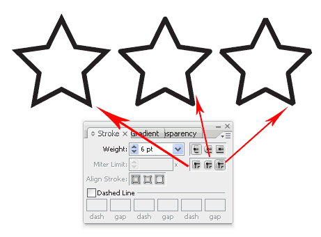
Miter Limit
The stroke’s Miter Limit specifies the appearance for the joins in a shape. Notice how the joins look after we applied different miter settings to the stars.
Applying Gradient to Objects
To apply gradient to your object, go to the Tool Palette and set it to Gradient Fill.

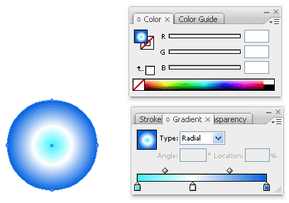
Open up your Gradient and Color Palette. By default it is a Grayscale gradient. Click Options icon at the corner and change it to RGB mode.

After we switched to RGB there will be slider and a color chart to pick the color. Choose a dark blue for it.

Do the same for the start point, change it to RGB and choose a light blue.

To add a new gradient stop to the gradient, click right below the gradient ramp to create a new stop. Change it to white color. To remove it, you can drag the stop out of the Palette.

To change the direction of the gradient, select the Gradient Tool from the Tool Palette. Click and drag in the direction you want the gradient to follow.

Radial Gradient
To set it to radial gradient, Choose Radial instead of Linear.
Pattern Fill
To create seamless pattern fill, we can choose the pattern fill from the Swatches.

Conclusion
Using radial and linear gradient, we can achieve alot of realism to our artwork. Radial patterns can add depth and volume to circle, and linear pattern can used to create volume for cylinders. Here is an example of gradients used to create a jingle bell.

Next Lesson: Editing Objects, Layers & Groups »
Back to Illustrator Training Course
The explanation of mitter limit is not quite correct. Mitter JOIN is in connection with mitter limit. Round join, Bevel join and Mitter join are types of joins in/on the stroke.
More about it:
http://livedocs.adobe.com/en_US/Illustrator/13.0/help.html?content=WS714a382cdf7d304e7e07d0100196cbc5f-6518.html
The above link is wrong. The right one is:
http://livedocs.adobe.com/en_US/Illustrator/13.0/help.html?content=WSA1E31D7D-13E6-41ac-AA8C-4AD129B9FC1C.html
(Change the caps or joins of a line)
Anyway, this tutorials are great. thanks!
Thanks puzzle, I have updated the information.
Great and simple as always!!
Fantastic tutorial, thankyou so much. Much better than the Adobe help, I finally feel like I’m getting somewhere learning Illustrator. I’m switching over from CorelDraw and finding it very tough going! I have a problem though, not sure if there’s a bug in my software or something… where you say “Open up your Gradient and Color Palette. By default it is a Grayscale gradient. Click Options icon at the corner and change it to RGB mode.” I do not get the option to switch to RGB, there are no options at all. So then I have no way to change the colours for the gradient, any help you can give would be fantastic, thanks again for the tuturial.
Hi jacqui, by default is a greyscale gradient. Nothing wrong. Open up you color palette at window>Color Palette. Click once on the little triangle on the gradient to select it. Then go Color Palette and click the options button (at the top right corner) and select RGB. Hope this helps.
Thanks! yeah, It’s realy nice tutorial.
Vectordiary, I have same problem as Jacqui had. I’m useing Illustrator cs2 that’s for I didn’t get optation to changed gradiant colour? I changed as you say “Grayscale to Rgb”. yes, there’s a opationes slider and a color chart to pick the color but I can able to change only single colour, when I clicked Gradient opation then colour changed into Greayscale gradient.
Yes,I got but how to perment fixe ” RGB”?
Hi Dipika, I’m also trying to figure to change the gradient to RGB permanently. Anyone got any solutions?
I also have the same problem as Dipka and I am using Illustrator CS4.
Ahh i figured it out. TO change the colors just double click on the house-shaped gradient sliders on the grayscale bar.
Great as usual.. thankss! 🙂
super tutorial
Im having the same concern.
once in gradient i get the default grey. no option for rgb
even widows does not have the colour palette option (CS3)
on clicking the house icon a colour palette comes up but the gradient disappears and becomes a flat colour
I am having the same problem. I follow the tutorial instructions to the letter to get colored gradient shading.
But every time I choose a color, the menu bar automatically switches away from gradient fill to standard fill. If I open up the gradient tool, it immediately turns black/white.
Please help me get colored gradient shading.
Hi Michael, first fill it with gradient. Then double click the little triangle pointer in the gradient palette to bring up the color palette. You can choose your color from there.
This is not a very good explanation, when you choose a colour, it seems impossible to transfer it to the gradient, leaving it always in grayscale. After squablling with it fot 45 minutes, I was finally able to transfer colour to the gradient simply by dragging it from the colour square in the colour panel to that big rectangle in the gradient panel. This way you can add many colours to the gradient, or remove them by dragging them to the empty space below. Naturally, at all times you will have at least 2 colours in the gradient (it wouldn’t be a gradient otherwise lol). Your new gradient will stick there for a session, but if you reload your doc, the gradient strangly resets to grayscale again. Cheers…
I think that a thing missing in this lesson is how to delete gradient stop. Anyway very good course.
They hear I have a small problem. At the time of creating a shutdown in degraded the nonencounter way to change the color to that shutdown. If they can help me I thank to them.
verry nice thx a lot..
susantha- srilanka
thanks for the amazing tutorial, I want to see some real retro work of some of these fonts. I mean are they really retro or just called retro for the sake of it?
Hello, thanks for the great crash course. I find it very useful. Still there’s one question I wanted to ask – is there any way to make gradient fade to transparency? Or shall it be reached only by workarounds, say, applying screen mode to the gradient-filled objects on top?
great tutorials, but as a contributing member who counts on sales from Istock to make a living, you are stealing the last image from a designer and Istock, that is why there is a watermark on the image. Please pay for the image if you are going to continue to use it, if not, I will turn this over to Istock as theft.
Thanks
Day10: Quite a fun lesson this one. I’ve always liked mucking around with colors and gradients and so on so this one didn’t seem like work at all – especially compared to a couple of the earlier lessons. I actually felt quite at home doing these. Mind you, everything always seems easy until you watch a pro doing it and then you try to do it yourself – a very different experience.
Excellent job on this section, I learned a lot about using gradients! However, the first time I read through the tutorial it wasn’t clear that the “Gradient and Color Palette” was actually two separate pallets. Please clarify this. Also, it would be useful for newer Illustrator users to explain how you opened the stroke, gradient, and color pallets in more detail.
Thanks 🙂
I am having a difficult creating a colored gradient. When click on a color, it stops being a gradient and just becomes a solid color. I don’t know what I’m doing wrong. Any help will be very much appreciated! Thank you for putting up these wonderful tutorials
to lu:
Try to drag the needed color from the Color or Swatches panel to your Gradient panel. Hope this will help.
All the other tutorials so far have been excellent but this one is disappointing in comparison. I am also finding that the colour thing just doesn’t work. Nothing appears when clicking on the “little triangle.” Dragging colours from the colour palette onto the gradient palette also doesn’t work…So frustrating!
Would be interesting to know if iStock came looking for you, btw!
Hi Beebee, try restarting your Illustrator again. clicking the triangle on the palette should show more options for color mode. Try it again.
Just to clarify on the istockphoto watermark image. It is created by me, just click on it to see it at my istockphoto portfolio. I’m not stealing anything. The watermark is there to prevent users from stealing my image without paying.
k on it to see it at my istockphoto portfolio. I’m not stealing anything. The watermark is there to prevent users from stealing my image without paying.ghhhhhhh
🙂
Supper, these are excellent vector tutorial. Thanks
yeoo thanks for the help my son it really helped me be me as a super star pop artiest much love keep doing yo thing kid #teambreezy
Yeoo who’s mans is this kid Chris brown. err body know i own vector diary, u betta get off my site or we gonna get it poppin again when i see ur bumass.
yeo boy what it do i love that christmas bell you mad bra bra keep doin yo thang playa
Yeoo i do my thang on this Vector diary. This site is #based all day boi.
My next mixtape comin soon subscribe lilbpack1 on youtube
These are a good attempt; but there are steps missing, making it irritatingly hard to work out what to do.
Pity….
I think these are the complete step which involve in the process. It is wonderful effort and really helpful in making good color and strokes.